When the mind is restless
and the spirit is out flying
blogs tend to take a backseat.
I've been slacking more often than not.
But work has definitely been picking up
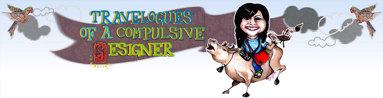
for us folks at D
I featured a certain caricature I'd done for a friend.
The caricature itself was done about a year back,
and the link to the post can be found here :
And what good use it has come to!
My friend has started his own site at
The background that reads "Media Is Social"
was entirely Arjun's idea, and the execution is mine.
The typography is courtesy me too.
A lot of work off late has started revolving around type.
If a picture can tell a thousand words,
then imagine what a good representative text could do!
Following are the doodles suggested for the banner for the brief as he gave me :
Cyberpunk!


Had the most amount of fun doing this one!
But I guess the complexity really did make it a bit incomprehensible.
Finally the following was decided upon
for a simple stark effect type that was both readable and very tech.

Various options were suggested
for a digital representation.


Though eventually a classic White on Black was decided upon,
I think some of them did turn up pretty darn cyberpunk!
Which as a genre, I personally think after much research,
lacks some good typography to match up to the animations and the graphics.
By and large, type remains to be an under explored subject
in the overall scheme of things.
So now coming back to the caricature
It has been used on the Bio section of the site

Its been modified to make Arjun maintain his geek-ery as he likes to call it!
In case you are wondering why it looks different from the original,
then its because its a patchwork of arjun's famous thick black geek glasses,
half of his nose and and his lips!
Arjun did you know that??
then its because its a patchwork of arjun's famous thick black geek glasses,
half of his nose and and his lips!
Arjun did you know that??
Hope you enjoy going through his site,
(though it is still a work in progress)
By the way, this post has been featured on this post!
(though it is still a work in progress)
By the way, this post has been featured on this post!
Promise to come back soon with more stuff!
great going! and very interesting!! keep it up:)
ReplyDeleteThanks so much Hitesh! :D
ReplyDeletelove arjun's face :-)
ReplyDeletehah! yeah I think it looks quite like him
ReplyDeleteArjun FTW!
ReplyDeleteand oh, Sonal too :-P