Wednesday, December 29, 2010

'Tis The Season to be MERRY!

'Tis the Season to be Merry!
And although christmas came and went,
the festive cheer is still in the air!
and we here at D have something extra special 
to share with you all!

Following are a set of X'Mas n New Year Ecards
developed for Amarchand Mangaldas, 
the law firm's Delhi office. 
Amarchand Mangaldas is the exclusive Indian member firm of 
Lex Mundi, the world's leading association of independent law firms. 
The firm has recently won the Indian Law Firm of the Year award at IFLR Asia Awards 2010, 
Firm of the Year - India award at Who’s Who Legal - Country and State Awards 2010 
and India Deal Firm of the Year award at ALB SE Asia Awards 2010.

KINDLY DO NOT COPY ANY OF THE ARTWORK,
All copyrights have been acquired by Amarchand Mangaldas
and are their property. 
They are being shared by their permission only, 
and any copying would only attract legal action.

Ecard 1
For general office use. 
Santa and Rudolph hug the Amarchand Mangaldas Building
and envelop it in all the Festive cheer!
Snow, snowflakes, sparkles, and all the baubles 
for all the employees!
Hope everyone had a wonderful Christmas!

Tools Used : Corel, Photoshop

Ecard 2
For the Lawyers.
The sparkling Crystal Ball
with the cute as a button Rudolph.
Standing adorably with the Christmas tree on his head, 
as the snowflakes fall around him and 
light up the christmassy red background!

Tools Used : Corel, Photoshop

Ecard 3
For Mr & Mrs Shroff
Sants hugs the crystal ball with Rudolph!
What joy!!

Tools Used : Corel, Photoshop

Hope everyone enjoyed this year
And I hope 2011 is only better!!
HAPPY HAPPY NEW YEAR FROM US FOLKS AT D!
:D


Sunday, December 26, 2010

First Commissioned Caricature!

Marhabba!
From the land of Muscat, Oman!

I know I've been away far too long.
First it was work, and now,
here I am in the land of 
dates and nighties, 
(pun intended, and no offense meant so kindly do not take any!)
visiting my sister and brother in law.

The past one month has been crazy!
With a bucket load of things to be shared, 
I assure you the following posts will have 
a vast array of interesting-ness on offer!

To begin with,
my first commissioned caricature!
By the very pretty and witty
Sweta Singh.
You can check out the doctor's blogs here and here.
Sadly we couldn't spend as much time together,
but with promises of a next time, 
it indeed has been a start of a new bond.

The caricature was commissioned for Doc sa'ab's 
would be sis in law and her hubby to be. 
And I must add, that all likeness is owed to her inputs entirely.

Though I do not have a picture of the couple with the artwork,
I am however going to share the caricature in progress 
till it was finally framed.

Sapna and Varun, are quite into yoga and head out to spiritual retreats,
hence it was decided that they be seated on 
Sapna's Pink yoga mat.
The overall color theme is also as pink as I could keep it,
since it is the bride's favorite color.
Varun is a lawyer and has an earphone tucked away in one ear at all times,
thus the lawyer's garb.
They're both surrounded with some of their favorite things.
Varun's penchant for big expensive cars,
And Sapna's music box.
Also loads of perfume bottles line up the front 
since both of them love them to bits! 

First Glimpse in pencil.

The color starts seeping in. 
And the detailing begins to emerge in little things such as
Sapna's one slightly bigger tooth, big eyes, and small feet. 
(I hope she wouldn't kill me if she ever met me in person)
:)
She's holding a Mic in her hand as she's a TV show producer,
and is clad in a pink saree 
(on the lines of the one she wore on her engagement
accompanied with the similar jewellery as well),
and is wearing her golden star pendant which she wears all the time. 

 Tools Used : Water colors, Acrylics, Colored Pencils, 
Rotring, Photo inks, Pencil  

And finally the complete artwork, 
fully painted.
It's titled "Love is in the air"
While "Love" takes shape 
out of the surrounding vines and leaves
"is in the air" is formed out of the 
electric wires running between two poles.
It also has two Love Birds getting cozy on them, 
while you can see the two poles on either side, 
framing the lovely couple. 

 Almost complete Artwork sans the vows.

And the final thing, with my 
signature style typography swirling around the canvas.


It was handed over to Sweta, framed and 
accompanied along with a wrapping paper and a red bow.


And I sincerely hope, 
both Sapna & Varun
would have liked it just as much as 
the wonderful girl who commissioned it!

Wednesday, December 8, 2010

Look me in the Eye

The dark night of the new moon,
lining the edge of her eye;
Led me to the saucer ful ocean,
of newsprint dye.
She rained on my thoughts,
from the folds of her skin.
I had to capture her,
in charcoal and ink.

Tools used : Charcoal stub, pencil, rotring, photo inks, 
newsprint collage in the background

Sunday, December 5, 2010

That 50s Show in Print

 I did a series of posts titled 

That 50s Show a while back, 
for a jewellery collection entitled Chiffon`e.
And the final test prints in color 
are finally in in!
If you're looking for the reference to the original illustrations,
you can find them herehereherehere and here.
The final brochure is accompanied with a 
matching chiffon (hence the name of the collection) scarf
in purple with a pink border.

The gray background is in matte and 
the illustrations are a tad bit glossier as they have a UV coating,
thus giving a 3d feel to them 
as they appear a little embossed upon touch.


Wednesday, December 1, 2010

Of Old Musings & New Pairings

As the work gathers momentum, what I miss are
sketching random sketches, and thinking random thoughts.
But perhaps what I miss more is going through them after 
a couple days / months / years
and chancing upon a pairing between the two. 
Its like being in the same state at different points in time.
There is an underlining stream of thought,
connecting them in more ways than the mere creative one.

The same things.
Over and over.

It all just goes on.
And on.
And on.

The buzz in the head,
mellows to mingle
with all the noises around.

There is a sleepy intoxication.

It makes 
even the handwriting,
drawl like a drunkard.

So much so, that 
you can't even recognize it
to be your own anymore.

But with every passing day,
the feeling doesn't remain as alien.
The cathartic knowing-ness,
settles in.
You get used to thinking
the same thoughts.

Everyday.

They sleep with you
and wake up with you
at odd hours.

Rising up at their whim.

The same thing.
Over and over.

Tools used : Water colors, Photo ink washes, acrylics, rotring ink,
pencil and marker.

The text in bold, chanced upon in an old diary from 2005, while I was in NY,
and the illustration originally titled "look me in the eye" from 2009.

Monday, November 8, 2010

Safety Comes First!

Real Adventures
Real Icons
And an output that is as unique as it gets.
I would admit I was at a wits end when I was asked 
to design a business card for a rafting camp.

After much thought and researching 
on what other camps had to offer in the country,
the path to be taken was pretty clear.
A simple yet effective card that would convey 
what the camp's strength is, 
I engaged global symbology which would be identifiable
by anyone across the globe at a mere glance.

Below is the first option that I proposed.
The card is built on a continuation of graphics from front to back, 
with the waves merging with the A of Archit.
Thus the elements are made to merge in such a way 
with the typography 
that there is a certain cohesiveness to the whole output.

It was suggested that the card be printed 
on a recycled gray hand made paper.

Following is the final Option that was decided upon
Adventure sports are an activity that involve
a great deal of safety and accountability
on the part of the organizer, 
hence adding the helmets and the life jackets
to say that yes it's an adventure but at the same time, 
they’re fully equipped to ensure your safety.

Eventually as it turns out, the rafting season had already started
and even though the card never saw the light of the day,
there still is a possibility and its still worth a share!

Thursday, November 4, 2010

Happy Diwali

Its that time of the year again.
The gleaming diyas illuminating the dark night,
The echo of chants invoking the gods of prosperity,
Its Deepwali!
and we at D4Design wish you and your loved ones 
a Happy and Prosperous one!

This is specially for everyone checking out the blog.
A very very very Happy Deepawali to all of you!
Thanks for all the comments / inputs / following
and appreciating over the months!

Lots of diyas
even more laddoos
(or any mithais / sweets for that matter!)
Best of both Ma Laxmi & Lord Ganesha, 
we at D4Design,
sincerely have to say this :

"Designers we are, intrepid & bold
Out in the world, amongst wonders untold.
Equipped with wits, and aesthetic sensibilities,
We nudge you to try us, and our many abilities.
We will bring you treasures and a wishing tree!
We wish you a prosperous and Happy Deepawali!"

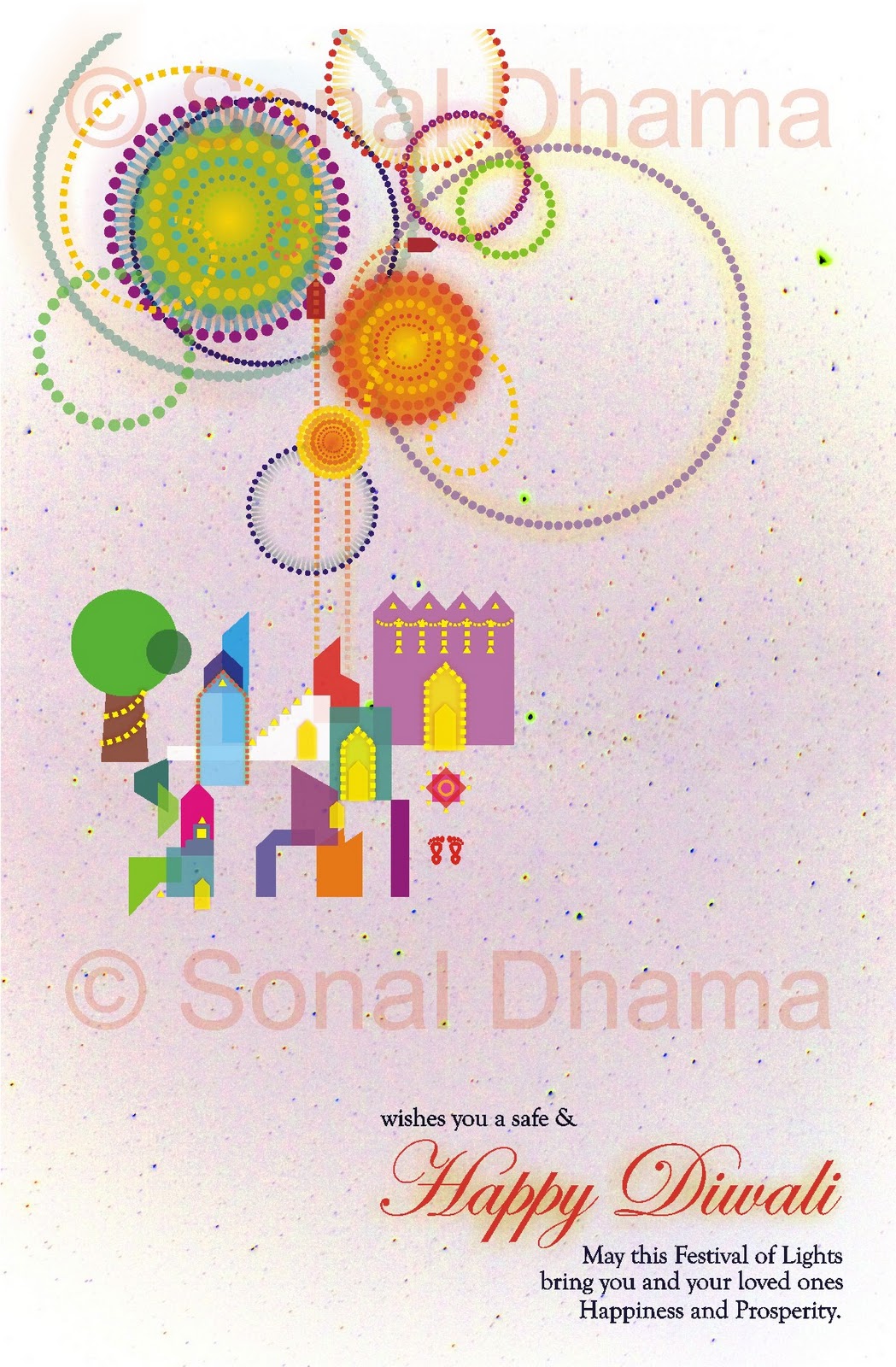
And this is the official D4Design Ecard.
Those of you on our mailing list, 
would have already received it.
The one hanging below is my partner in crime,
Most of you have already seen him here

Following are some of the commissioned Ecards we did for someone
we go back with since kindergarten!
Can't reveal much more, 
but in case any of you would have received any diwali wishes from them, 
you would know!

The watermarks obviously did not appear on the original artwork.
(And this particular one was rejected), 
but it laid the ground work for what was to follow.

It depicts a small township,
the big house in pink depicting the firm it was commissioned for,
as the lights light up the facade brighter, 
the rangoli upfront invites one in,
and its being visited by the goddess laxmi herself.

Another option of the same was presented for a calmer,
more cheerful version.

The second concept has Lord Ganesha acting as 
the lady of justice.
(Yes it was a law firm, hard to hide that now!)

He mischievously looks from under his blindfold and
eyes the weighing scale that is filled with laddoos on both sides.
He holds a mallet and secretly wishes to say
"Order Order!!"
(for all the disarray that besets the world at the moment!)

This too was not opted for and was refined further as you can see below.

A more adolescent Ganesha with color within lines. 
It was refined further, 
till it reached a cuter, more child like stage.

Baby Ganesha
Wishing everyone self awareness this Diwali.
Floating in a the calm tufts of clouds,
with wisdom, 
hunger for knowledge 
(for he carries his books up there),
laddoos,
(yes, I love them!)
fireworks,
(for all the glitter and sparkles in the sky)
and blessings

"One who sees all
but whom no one beholds,
One who illuminates the intellect,
the sun, the moon and the stars
and the whole universe
but whom they can not illumine,
That indeed is the inner self.
This Diwali, illuminate the self,
illuminate the world."

The layout that was finalized was close to this one, 
and perhaps I would be able to share it with you once the festival passes us by.

The third concept took off on a simple brief that asked for
diyas to be used creatively

What better way to illumine the entire world?
the feedback however was to avoid the color black,
and to instead go for something brighter and cheerful.
India was also asked to be paid special attention to.

The layout that was finalized was close to this one, 
and perhaps I would be able to share it with you once the festival passes us by.

It was animated and all the diyas of the world
twinkled and sparkled.

What better way is there to wish one a Happy Diwali.
Save Paper, opt for Ecards.
Please don't burst crackers, 
really they pollute a hell lot and scare my doggie to bits!

Lets be a little more sensitive to our surroundings
and enjoy a Deepawali that truly is Happy for everyone around.

Warm wishes from us folks at D!

Sunday, October 24, 2010

Type-ful Graphics!

When the mind is restless
and the spirit is out flying
blogs tend to take a backseat.
I've been slacking more often than not.
But work has definitely been picking up
for us folks at D

I featured a certain caricature I'd done for a friend. 
The caricature itself was done about a year back, 
and the link to the post can be found here :

And what good use it has come to!
My friend has started his own site at
The background that reads "Media Is Social"
was entirely Arjun's idea, and the execution is mine.

The typography is courtesy me too.
A lot of work off late has started revolving around type.
If a picture can tell a thousand words, 
then imagine what a good representative text could do!

Following are the doodles suggested for the banner for the brief as he gave me :
Cyberpunk!


Had the most amount of fun doing this one!
But I guess the complexity really did make it a bit incomprehensible.
Finally the following was decided upon
for a simple stark effect type that was both readable and very tech.


Various options were suggested 
for a digital representation.

Though eventually a classic White on Black was decided upon, 
I think some of them did turn up pretty darn cyberpunk!
 Which as a genre, I personally think after much research, 
lacks some good typography to match up to the animations and the graphics.
By and large, type remains to be an under explored subject 
in the overall scheme of things.

So now coming back to the caricature
It has been used on the Bio section of the site

Its been modified to make Arjun maintain his geek-ery as he likes to call it!
In case you are wondering why it looks different from the original,
then its because its a patchwork of arjun's famous thick black geek glasses,
half of his nose and and his lips!
Arjun did you know that??

Hope you enjoy going through his site,
(though it is still a work in progress)
By the way, this post has been featured on this post!

Promise to come back soon with more stuff!

Sunday, October 10, 2010

Interrogating Complicities

How does the category “queer” and the critical practice of “queering” translate, as it travels from its historical specificity in the US to other global, postcolonial contexts? Does the postcolonial get elided within discussions of Queer transnational and globalization studies? The conference showcases work that asks these questions, among others, and invites discussion on the possible complicity of the postcolonial and the queer with the normative.

http://complicities2010.umn.edu/
Interrogating Complicities 
Postcolonial, Queer, and the 
Threat of the Normative
University of Minnesota, Twin Cities
November 16-16, 2010

A poster developed for a friend who is involved in organizing the conference.

Tools Used : Photo ink washes, 
with a simple structural graphic overlay on corel and photoshop.

The design sensibility is greatly inspired from 
the famous and influential school of avant-garde art -
Bauhaus.

Use of geometry, patterning, imagery, and lettering
to create simple, direct graphics
that reflect the overall aesthetic message of clarity and boldness
play a pivotal role in arriving at the end result. 

The Bauhaus (1919 - 1933) 
firmly established industrial design 
and with it stripped away the decoration, 
and left clean lines of function.
To some it represented the removal of all that is human,
but a personal bent towards those very exact human errors
made me choose a background that is created with photo ink washes.
Thus what is arrived at is an amalgamation of both the hand made 
and the industrial.

Wednesday, October 6, 2010

That 50s Show Finale

On a gray granular sky,
floats the love story
of Steve and Emma.

He's looking for
that special ring for her,
and is in grave dilemma!
He calls her sister Emily,
and she really is Family.
She knows her Ems deep,
and comes up with a solution
promptly!

Following is the final layout of the handout.
Imprinting Steve and Emma's love for each other.
To be shared with those who're looking to make a commitment.

Tools used : Cartridge stained with tea and photoinks.
Emily painted and lined with acrylics, water colors, poster paints, colored pencils, 
photo inks, rotring, and pretty much anything and everything!
And assembled on Corel and Photoshop. 

Following is the test print depicting the fanfold.
Its slated to have a little chiffone scarf around it
(hence the name).
But is currently in satin of course :-/


And with this we've come to the end or perhaps the beginning of a beautiful love story.

Monday, September 27, 2010

That 50s Show Part IV

We have already established that 
Steve and Emma 
are in love.

But really, you gotta see it to believe it right?!
What better than a petite young lady
in a warm embrace with a tall, well suited handsome lad?!
Both of their faces lit up with a warm smile,
the one that's born out of a satisfaction for being in the moment.

Embrace on the first glimpse.
Tools : The good ol' pencil

Emma's arm in this first sketch looked rather chunky,
hence necessary steps were taken to make them toned,
as shown in the sketch below.

Tools used : Cartridge stained with tea and photoinks.
painted and lined with acrylics, water colors, poster paints, colored pencils, 
photo inks, rotring, and pretty much anything and everything!

There is a slight play with light and shadow 
to make the sketch come to life a bit.

A simple well cut evening dress in turquoise,
teamed with a simple pair of diamond studs,
spell a style that is refined with a classic bend.
The hand resting on Steve's shoulder is repositioned,
the reason for which I can't yet reveal, 
though I can say  that it is but a mere prop after all!


Steve clad in a brown suit, 
teamed with a classic white shirt
and a red tie,
is definitely inspired from Don Draper
(I wouldn't lie),
His big hand around Emma's petite frame
inspires a sense of security
like he will be there for her till eternity!
*sigh, how yummy is that really?!


And finally them both on the background we need em on!
What bliss on a winter-y gray stained sheet!

Wednesday, September 22, 2010

That 50s Show Part III

Introducing 
Emma


An independent young woman.
A successful dentist.
A perfectionist who is loved by her patients 
as much as by her family.

Steve thinks she still makes her college denims look hot!

Emma on the first glimpse.
Tools used : Cartridge stained with tea and photoinks.
Emily painted and lined with acrylics, water colors, poster paints, colored pencils, 
photo inks, rotring, and pretty much anything and everything!
The delicate nose,
A full red mouth that smiles a kind smile,
A flawless complexion (fit to star in a ponds advert),
A delicate yet strong jawline,
hint of cheekbones,
an overall pleasant personality 
who people would find easy to trust and love.
*sigh

Emma photoshopped 
to match the rest of the characters' skin tones you see!

Clad in her white clinical coat,
Green surgical gloves,
A pearl drop earring to hint a classic sort of taste in things,
Refined, classy, timeless.

Emma, right where we need her to be...
in a thought bubble!
Steve's of course!

The little brunette girl has beautiful soft curls,
Rosy pink cheeks,
Is clad in a ruffled puffy sleeve frock 
of red and white pinstripes.
A perfect poster child of the 50s, 
ready with a smile!

Emma on the background we want her on 
to fit into the layout and the overall scheme of things.

So this completes our lineup of the characters,
Next post onwards, I say let the story begin!!
Stay tuned!

Sunday, September 19, 2010

That 50s Show Part II

A mellow and rainy monday to y'all!

So true to my word, 
here is Emily.

Emily on the first glimpse. 
Tools used : Cartridge stained with tea and photoinks.
Emily painted and lined with acrylics, water colors, poster paints, colored pencils, 
photo inks, rotring, and pretty much anything and everything!
 
A 50s style pin stripe shirt,
teamed with a black skirt,
worn under a white scalloped apron. 
Hair inspired from Ava Gardner but yet not there,
longer and pinned up in an effort to look younger!
Quite a plain jane, 
(unlike Emma)
A deliberate consideration of course!

 Emma gets a new mouth and new eyes!
And a stool to sit on!

It was felt that she was well way too plain!
Like she wasn't happy to get the call from Steve...
So Emily gets a makeover
A new smiling mouth
and kind brown eyes!

Emily gets a Phone!

A blue retro landline
with a long twisty chord,
the kind they had in the good ol days.
Whole point is the call she is getting from Steve after all!
Emily gets grocery too

To complete her make believe world,
we get her the staples,
granulated sugar,
milk, cereal,
tomato juice,
mayonnaise,
peanut butter,
and some tooth paste too.

And finally we have her on the background we need her on.

But I still can't reveal what Steve has to say to Emily,
all the way from his red phone
to Emily's blue one...
But its all about Emma!

So make sure to check out the next post for Emma!