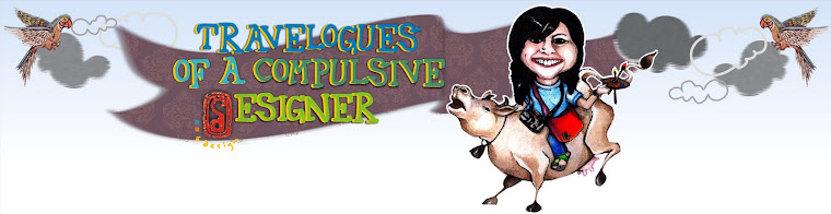
The aim was to create a mascot of sorts that could lend a personality to the brand.
Mascots are defined as a term for any person,
animal, or object thought to bring luck
or act as fictional spokespeople for the goods being delivered.
I personally feel, they are a boost to your visual identity,
they add a human touch and let you play,
I personally feel, they are a boost to your visual identity,
they add a human touch and let you play,
they add fun to something as boring as a serious adult life.
I know that they work better with consumer goods,
where there is something more tangible involved as opposed to a service,
but a little bit of entertainment can go a long way in being memorable for your customers.
I know that they work better with consumer goods,
where there is something more tangible involved as opposed to a service,
but a little bit of entertainment can go a long way in being memorable for your customers.
Thus, since the firm is made of relatively young people,
it was decided the characterization too had to be in line with that.
Hence a little playfulness was incorporated
via this next option :

I can see your love for this font (can't remember its name, though) hasn't faded at all... ;-)
ReplyDeleteyou ma'am are right, isocpeur is the name.
ReplyDeletewaiting for #3 ;)
ReplyDeletehey! yeah i know, was down with flu so got delayed :(. but am up now, shall upload today
ReplyDeleteAwwww! Hope you're feeling better! I feel bad for putting the pressure now. But I'm sure it feels good to know someone's waiting!! And I also sure I'm not the only one... Loving your blog! :)
ReplyDeleteHey hey hey!! You've made my night you know that!! I know Im not delivering on the promise but trust me, have lots of new stuff up my sleeve!!
ReplyDelete